[Case 03]
KIOSK ATR/BPN: A Streamlined Land Certificate Printing Interface
Goverment
KIOSK ATR/BPN: A Streamlined Land Certificate Printing Interface
Improving Public Self-Service Efficiency
[Project Overview]
Kementerian Agraria dan Tata Ruang/Badan Pertanahan Nasional (ATR/BPN) has introduced a Self-Service KIOSK to make it easier for the public to print land certificates independently. This system already has a well-functioning workflow (flow) that complies with regulations.
[Redesign Objectives]
Enhancing visual appeal without altering the existing workflow.
Aligning the UI with the government institution's (ATR/BPN) identity.
Simplifying the interface for easier understanding by users from diverse backgrounds.
Ensuring the design remained compatible with KIOSK touchscreens.
[Industry]
Goverment
[My Role]
UI Designer
[Platforms]
KIOSK
[Year]
2024
Disclaimer: All data, information, and visuals presented in this case study are dummy or conceptual data created solely for the purpose of UI/UX design and showcasing.
[The Design Process]
[Existing UI Audit]
I started the redesign process by conducting a visual audit of the existing User Interface (UI). This audit aimed to identify visual elements that could potentially disrupt the user experience when using the KIOSK machine to print land certificates independently.
Here are some of the main issues I found during the evaluation process:
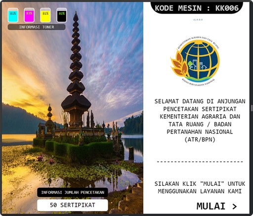
Lack of Clear Visual Focus
The initial display lacked clear visual focus. The background image was too large and irrelevant to the ATR/BPN identity, while crucial elements like the "Start" button and instructions appeared submerged without a clear hierarchy. Instead, toner information stole attention at the top, disorienting the user's eye path.
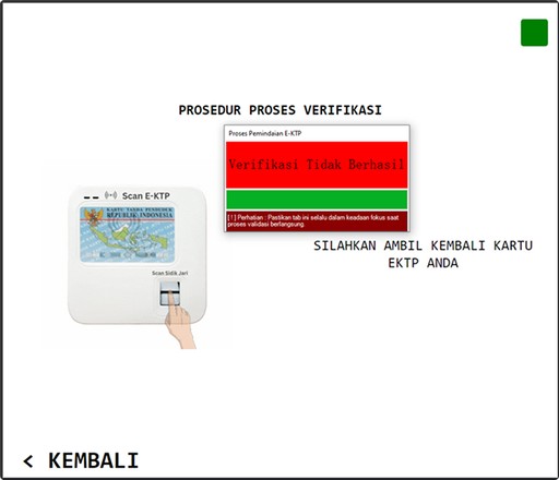
Unclear Hierarchy and No Actionable Recovery Step
The verification display lacked clear guidance and overemphasized prominent error messages without offering solutions. Instructions were scattered and unstructured, and users weren't given options for next actions. Illustrations didn't help users understand the process, and whitespace wasn't functionally utilized.
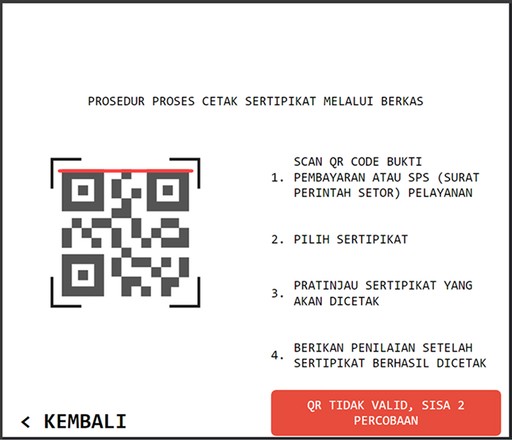
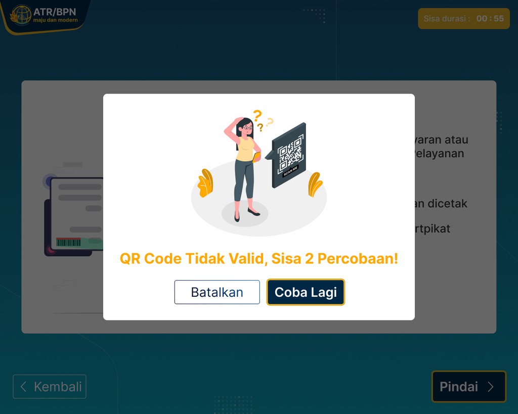
Lack of Visibility and Guidance During QR Code Scanning
The QR scanning display lacked sufficient visual feedback and tended to confuse users when errors occurred. Instructions were too dense and poorly structured, while error messages appeared without providing solutions. There were no visual elements to help users understand the ongoing scanning process.
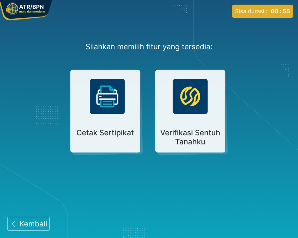
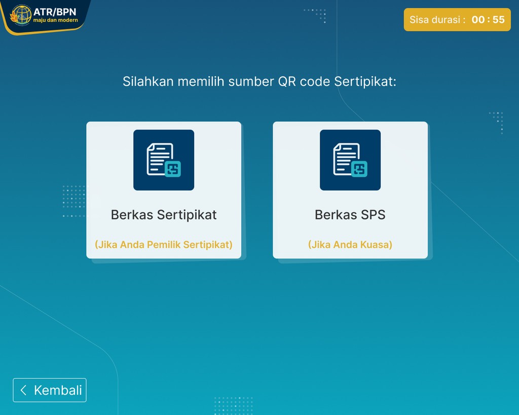
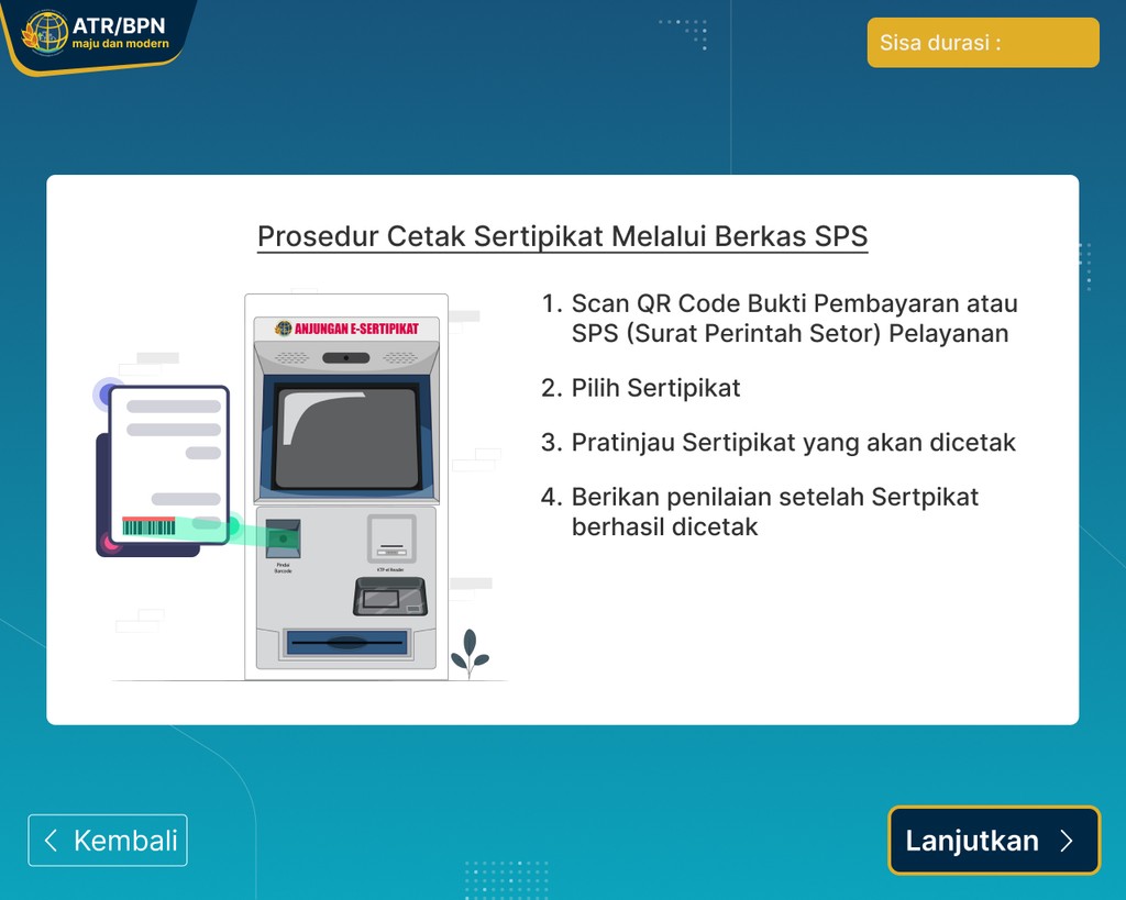
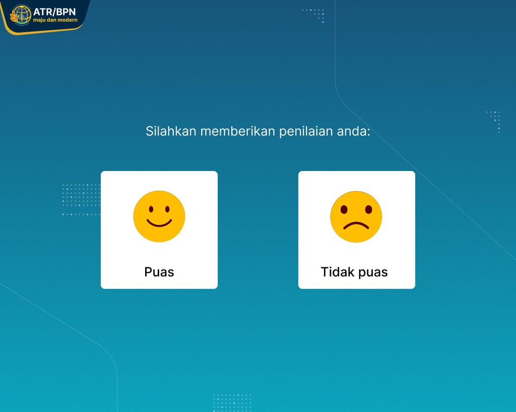
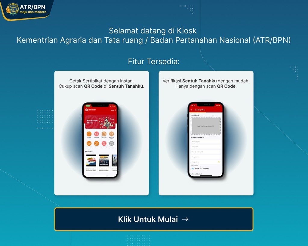
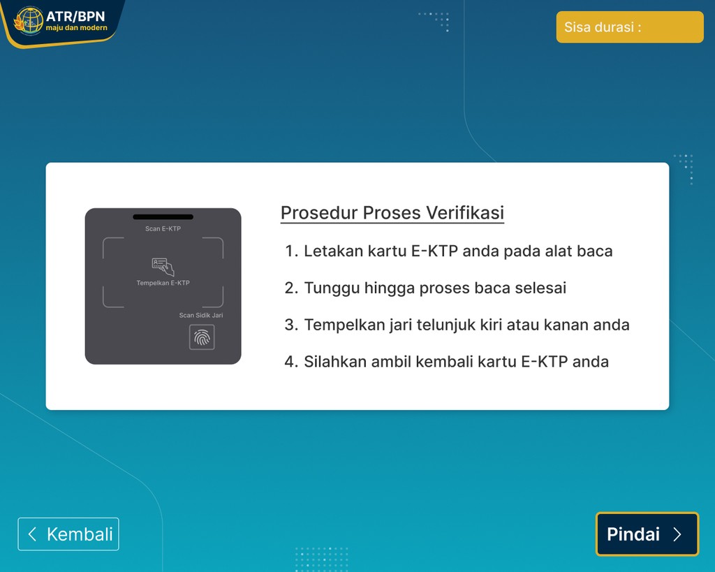
Design highlights
The ATR/BPN KIOSK introduces an integrated interface designed to streamline the self-service process, facilitate data verification, and enhance user convenience in printing certificates quickly and efficiently.
[Main Components of the Redesign]
[Outcomes and Impact]
Enhanced clarity of service flow: Users can now more easily understand steps like verification and printing, thanks to a more structured layout and clear system messages.
Faster and more efficient interaction: Action buttons are now more prominent and intuitive, reducing confusion during navigation.
More modern and user-friendly appearance: The visual design now reflects ATR/BPN's professional identity and serves the public inclusively.
Reduced potential for user errors: Clear feedback and supporting illustrations help users complete the process without needing assistance from staff.
[Takeaways]
Design isn't just about aesthetics, it's about guidance: A clean and structured visual layout can guide users even without verbal instructions.
System feedback is crucial: Pop-ups, indicators, and visual responses help users feel confident and not lost when using the KIOSK.
Designing for all demographics: This project highlighted the importance of simplifying interfaces to reach users of various ages and digital literacy levels.
UI consistency = User trust: Harmonized colors, typography, and icons help create a professional and trustworthy experience.